Every year, interior design trends come and go, and commercial painting is no exception. More than just a coat of paint, these trends reflect a drive towards sustainability, a deeper connection with nature, and the desire to create spaces that look great and feel even better.
As we make our way into 2024, businesses are taking the time to update and refresh their spaces for the new year with a fresh paint job. But what should we be taking into consideration when choosing how to update a space? This article will explore some of the ways commercial painting will continue to evolve in 2024.
Biophilic design might sound like a space-age concept, but you’ve probably seen it happening all around you. It is a design principle that seeks to incorporate elements of nature into the built environment. It’s why you see vertical indoor gardens, earth tones and murals of flowers in many businesses now.
The idea behind biophillic design is that exposure to natural materials, colours and textures promotes well-being and enhances the connection between people and nature. Using paint in commercial spaces is a versatile and effective way to integrate biophilic design principles.
Here are some ideas on how to achieve this:
– Choose a colour palette inspired by nature. Earthy greens, soft blues and even darker shades of brown can create a calming and organic atmosphere.
– Use muted and subdued shades to mimic the colours found in natural environments.
– Integrate patterns inspired by nature, such as leaves, branches, or water ripples. These patterns can be applied using stencils or wallpapers to add a touch of nature to the walls.
– Consider incorporating patterns that mimic the textures found in natural materials like wood or stone.
– Use paint to create organic shapes on walls, mimicking the curves and contours found in nature. This can break away from the rigid lines of traditional commercial spaces.
– Consider using colour gradients to simulate natural transitions found in the sky or landscapes.
– Experiment with textured paints or finishes that simulate the feel of natural materials like stone, wood, or even water.
– Incorporate matte finishes to reduce glare and create a more natural ambience.

In recent years, businesses have made a significant shift towards environmental preservation. This heightened awareness has paved the way for the surging demand for sustainable painting materials. These eco-friendly products, low in volatile organic compounds (VOCs), are becoming the go-to choice for companies aiming to minimise their environmental footprint. VOCs are notorious for their harmful effects on both the environment and human health, making reducing them a vital factor in the selection of painting materials.
Choosing these sustainable paints has a two-fold benefit for businesses. On a macro level, it aids in reducing the overall environmental impact, contributing to the global effort to combat climate change. At the micro level, it ensures healthier spaces for employees and patrons, drastically lowering the health risks associated with VOCs.
However, as with any major switch, there are certain points to consider. Firstly, eco-friendly paints might be slightly more expensive than their conventional counterparts. However, this cost is offset by their long-term benefits to the environment and human health. Secondly, it’s essential to verify the authenticity of the product and the brand’s claims. Look for certifications from reputable environmental bodies to ensure the product’s sustainability.
In terms of application, it’s worth noting that eco-friendly paints, despite their natural composition, don’t compromise on performance. They provide excellent coverage, durability, and colour retention, on par with conventional paints. Furthermore, they offer a broad colour palette, catering to the aesthetic preferences of diverse businesses.
Looking for eco-friendly commercial painting in Clayton, Chadstone or Rosebud? Resolute Painting & Projects works with Haymes Paints, Dulux, Taubmans and Sherwin Williams to source low-VOC paints that won’t compromise on quality.
Murals are becoming a popular choice for businesses looking to add a distinctive flair to their commercial spaces. Walking into a space adorned with a hand-painted mural that tells a story or a geometric design that captivates the eye is sure to excite customers and employees alike. These artistic elements have the potential to elevate the style of a space, adding personality that resonates with your brand and the people who engage with it.
However, there’s a fine line between enhancing and overpowering when it comes to incorporating murals and designs in a commercial space.
Choosing a mural or design can seem like an overwhelming task, given the multitude of options available. Should you opt for a hand-painted mural or a geometric design? The answer lies in understanding the essence of your brand and the message you want to convey. A hand-painted mural can infuse your space with a sense of history, tradition, and craftsmanship, while a geometric design can lend a modern, cutting-edge vibe.
It can be challenging to balance the style of a mural without making a space feel overwhelming. This is where the expertise of a professional painter can prove invaluable. A professional painter can guide you through the process, ensuring that the mural or design complements the space rather than dominating it. They can help you to select colours that align with your brand values and the mood you wish to create.
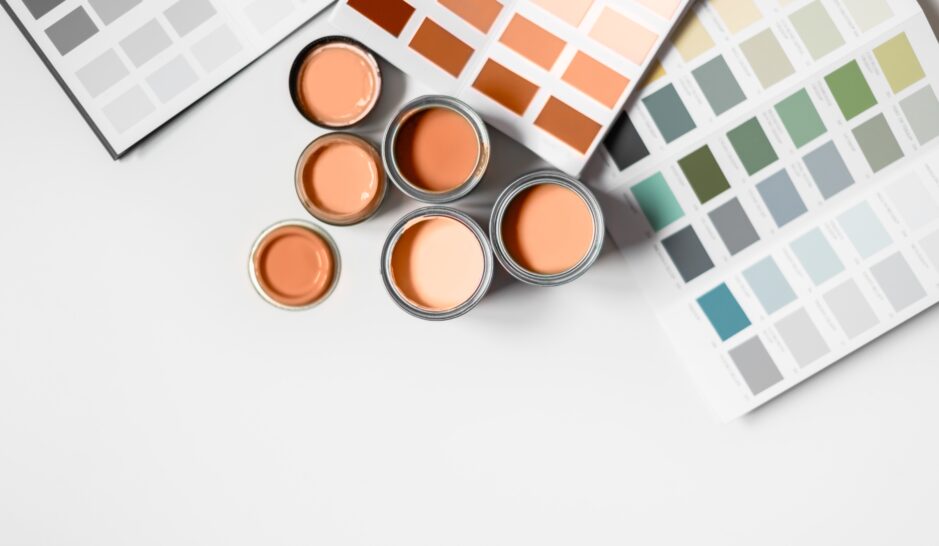
Pantone’s Colour of the Year is a highly anticipated announcement in the design world, influencing trends in fashion, home decor, and commercial interiors. The 2024 choice, Peach Fuzz, is no exception. This warm, inviting shade sits somewhere between pink and orange, making it adaptable to a wide range of spaces. Peach Fuzz is a tone that can work as an accent colour or the main hue, embodying versatility and style.
The beauty of Peach Fuzz lies in its adaptability. It can be introduced subtly through accent accessories like cushions, artwork, or even a feature wall in a cosy café. On the other hand, it can take centre stage in contemporary offices, perhaps as a bold wall colour or substantial furniture pieces. Peach Fuzz offers a versatile yet stylish choice for businesses looking to update their interiors.
There are several advantages to incorporating Peach Fuzz into a commercial space. Firstly, it’s a warm, friendly colour that can create a warm and inviting space. This can be particularly beneficial in industries where creating a comfortable, positive atmosphere is key, such as hospitality or customer service. The modern and fresh undertones of Peach Fuzz can also help to update and rejuvenate a space, keeping it on-trend and appealing to customers or clients.
However, as with any design decision, there can also be potential pitfalls to consider. Peach Fuzz, while versatile, may not align with all brand identities or existing interior schemes. Considering the overall aesthetic and message a business wants to convey is essential before making any drastic changes.
When considering the application of Peach Fuzz, here are a few tips. Firstly, balance is key. If using Peach Fuzz as a primary colour, balance it with neutral tones to avoid overwhelming the space. Secondly, consider the lighting of the space. Peach Fuzz can change in tone under different lighting conditions, so it’s advisable to test it in the intended area before committing.
Colour blocking, a technique that pairs contrasting hues to create visually striking environments, is gaining popularity among businesses aiming to create high-impact spaces. This technique is all about balance and strategic placement of colours. Pairing bold colours like cobalt blue with softer, pastel hues can create an energising yet harmonious atmosphere. This design strategy isn’t just about walls—ceilings and flooring can contribute to a cohesive colour-blocked space.
Despite its visual appeal, colour blocking does come with a few challenges. For one, pairing colours that clash can create a jarring, uncomfortable space. To avoid this, it’s crucial to understand colour theory and choose hues that complement each other. Secondly, overdoing it can lead to a chaotic and overwhelming visual experience. The key to successful colour blocking lies in the right balance—thoughtful use of neutral spaces can provide a visual break and keep the overall design grounded.
Metallic elements are another trend set to shine in 2024. They bring a touch of luxury and sophistication, adding depth and interest to a space. Whether it’s a copper accent wall or a silver-toned furniture piece, metallics can elevate a commercial space from ordinary to extraordinary
The key to using metallics effectively is to treat them as accents rather than the primary design element. Too much metal can make a space feel cold and sterile. Instead, coupling metallics with warm, natural materials like wood or stone can create an appealing contrast and add a sense of warmth and comfort.
As you can see, commercial painting and design trends are moving towards sustainability, connection with nature, and unique expressions of creativity. By embracing these trends, businesses can create spaces that are not only visually appealing but also foster productivity, well-being, and environmental responsibility. As we continue to navigate the future of design, one thing is clear: the possibilities are as diverse and dynamic as the businesses they represent.
If you’re looking for a commercial painter Melbourne with their finger on the pulse of the latest trends, Resolute Painting & Projects is the ultimate choice. We have experience in interior and exterior painting and even made some sophisticated geometric murals for clients looking for something a bit different.
To organise your free site inspection and quote, get in touch with us today. We look forward to helping you refresh your space for the new year.
